

Professional Printed Faux Rabbit Fur Carpet Design Ideas for a Cozy and Elegant Home
2026-09-01
There’s a particular kind of magic in a professional printed faux rabbit fur carpet: it softens a room’s edges, yet the print gives it structure. Without that graphic layer, you have a nice shag—comfortable but anonymous. With it, you have a focal point. That’s the thinking behind the ideas collected here, which range from oversized houndstooth in a reading corner to soft watercolor florals that keep a bedroom from feeling too serious. Each concept leans into the cozy-elegant tension: plush enough to sink your toes into, refined enough to hold its own against tailored upholstery and brass accents. For sourcing pieces that don’t compromise either way, keep an eye on Senseco.
Layering plush carpets over hardwood for instant warmth
Hardwood floors have a clean, timeless appeal, but they can feel cold underfoot the moment temperatures dip. Instead of committing to wall-to-wall carpet, layering a plush area rug gives you that same cozy sensation without hiding the wood entirely. The key is choosing a thick pile—think shag, wool, or a dense synthetic blend—that sinks slightly when you step on it, instantly warming the room both physically and visually.
Placement matters more than you might expect. In a living room, anchor the front legs of your sofa and chairs on the rug to create a unified seating zone that feels intentional rather than accidental. For bedrooms, let the rug extend at least two feet beyond each side of the bed so your first step in the morning lands on softness instead of cold boards. Layering a smaller, contrasting rug on top of a larger natural fiber one can also add depth while keeping maintenance simple.
Don't overlook the practical benefits hiding in that plush layer. The carpet acts as insulation, trapping warm air and reducing drafts that rise through floor gaps. It also absorbs sound, making an echoey room feel more intimate. If you're worried about sliding, pair the rug with a quality felt or rubber pad—it keeps everything in place and adds an extra cushion of warmth between you and the hardwood.
Printed motifs that borrow from winter botanicals
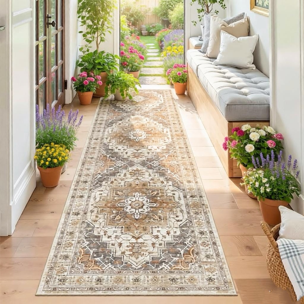
Winter botanicals offer a quietly dramatic palette of form and texture. Frosted pine needles, skeletal seed heads, and the waxy blush of hellebores translate into prints that feel grounded rather than overly festive. Designers are pulling from these cooler, less predictable sources—think dried hydrangea panicles and the architectural line of bare branches—to create motifs with an almost etched, botanical-study quality.
The appeal lies in restraint. Instead of loud holiday clichés, these prints layer muted sage, charcoal, and ash blue with occasional pops of oxblood or berry. Scale varies from dense, all-over sprigs to oversized single stems that wrap across a garment or upholstery panel. The result reads as collected and artful, closer to a herbarium sheet than a seasonal novelty.
Textile choices deepen the effect. Matte, natural-fiber grounds such as linen, brushed cotton, or wool crepe let the printed lines breathe, while occasional metallic accents mimic frost catching on a leaf edge. This approach suits interiors and apparel alike, giving winter florals a longer life beyond the cold months.
Muted earth tones that anchor a room without shouting
There’s a quiet confidence in shades drawn from clay, sand, and stone. They don’t demand attention the way a bold accent wall might, yet they give a space its backbone. A living room wrapped in warm greige or dusty terracotta feels settled, as if the walls have been there for decades, holding conversations and late nights without ever raising their voice.
These tones work because they absorb light rather than fight it. A muted olive or faded ochre softens the edges of a room, making it easier to layer in textures—linen throws, raw wood, hand-thrown ceramics—without the palette feeling busy. The colors recede just enough to let furniture and artwork breathe, but they never disappear entirely.
The trick is to avoid flatness. Pair a washed-out sienna with a deeper umber in the same family, or let a chalky sage sit against natural plaster. The room gains depth without losing its calm, proving that restraint can be the boldest choice of all.
Balancing faux fur softness with sleek metallic legs
The chair invites you to sink into a cloud of plush faux fur, its fibers catching the light with a subtle, tactile depth. That softness is grounded by the sharp gleam of slim metallic legs, which slice through the warmth with an almost architectural precision. The result is a piece that feels both indulgent and disciplined, like a whisper wrapped in steel.
Where the faux fur drapes over the seat and back, it creates a continuous, enveloping surface that seems to float just above the floor. The metallic legs, with their polished finish and tapering profile, refuse to disappear. Instead, they anchor the design, pulling the eye downward and giving the chair a sense of lift and permanence. This contrast keeps the piece from tipping into either pure comfort or cold minimalism.
The balance emerges in the details. The fur is dense enough to hold its shape yet soft enough to yield under pressure, while the legs are engineered for stability without visual heaviness. Together, they create a dialogue between the organic and the industrial, making the chair a natural fit for rooms that blend soft textiles with hard surfaces.
Placing these carpets in reading nooks and window seats
Tucking a textured carpet beneath a window seat transforms the corner into a quiet retreat, where morning light lands on wool fibers and makes the space feel pulled together rather than accidental. The softness underfoot encourages bare feet, while the pattern anchors the nook visually so it stops reading as dead space.
In a reading nook, a dense, low-pile rug works harder than a plush one—it holds up to the constant shifting of a chair or floor cushion and keeps books from wobbling on a side table. Choose a design with irregular borders or a slightly washed-out palette, so lint, pet hair, and the occasional coffee drip blend in instead of standing out.
Window seats benefit from a carpet cut close to the bench edge, leaving just a hand's width of floor visible to frame the area. Layering a smaller hide or kilim on top adds a lived-in feel without overloading the room, and it makes the seat read as intentional rather than a leftover ledge with a cushion.
Reviving flattened fibers with a cool-air shake and brush
When fibers get crushed flat from heavy foot traffic or long storage, a blast of cool air can work wonders. Cold air helps the strands lift and separate without the risk of heat damage that comes from a standard dryer cycle. Start by giving the item a vigorous shake outdoors or over a drop cloth to loosen embedded dirt and break up matted clumps.
Next, set a hair dryer or a pet grooming dryer to its cool setting and move it in short, sweeping passes across the surface. Keep the nozzle a few inches away so the air pressure fluffs the fibers rather than plastering them down. While the air is flowing, drag a stiff-bristled brush through the pile in the same direction, then against it. This back-and-forth motion re-teaches the fibers to stand upright and restores their original loft.
For stubbornly flattened areas, repeat the cool-air and brushing pass two or three times, pausing between rounds to let the material settle. Avoid using warm or hot air, which can set the flattened shape permanently on synthetic blends. With a little patience, the fibers will spring back, and the texture will feel noticeably softer and more resilient underfoot.
FAQ
The printing process adds depth without flattening the pile, so you get subtle pattern shifts that catch light naturally. The base fiber is usually a low-shed micro polyester designed to mimic rabbit fur's density, while the print adds visual texture rather than relying on dye lots alone.
Stick to tonal prints or small-scale motifs like delicate branches, faded medallions, or abstract watercolor streaks. These read more like a soft textile than a graphic statement, and the low contrast keeps the floor visually light.
Bedrooms and sitting areas gain the most because barefoot comfort matters there. A printed style works particularly well next to a reading chair or at the foot of a bed where the pattern is seen up close.
Yes, if you pick a dense, short-to-medium pile and avoid long shag versions. The print itself won't rub off on quality pieces because it's applied to heat-set fibers rather than surface painted, but rotating the rug monthly evens out wear.
Warm oat, smoked lavender, dusty rose, and deep teal all print beautifully on faux rabbit fur. They add enough pigment to define a seating area but stay muted enough to layer under furniture and textiles.
Layer it over a low-profile natural fiber rug like sisal or jute, letting two or three inches of the base rug show around the edges. That contrast between matte weave and soft printed fur creates a considered, collected look.
Vacuum with a suction-only attachment, never a beater bar. For small spots, blot with a damp white cloth and mild wool-safe detergent, then brush the pile gently in one direction while it dries to keep the print crisp.
A thin felt and rubber combination pad works best on hard floors. It stops the plush surface from sliding and adds a bit of cushion, but avoid thick memory foam pads because they can make the fur look uneven at the edges.
Conclusion
Layering a printed faux rabbit fur carpet over hardwood changes the room's temperature before the thermostat does. The pile catches lamplight and softens footfall, and the prints - borrowed from winter botanicals like frozen ferns, dried seed heads, or bare branch shadows - read as collected rather than manufactured. Muted earth tones help here: oat, clay, smoke, and dusty pine anchor a room without competing with furniture. Tuck one of these carpets into a reading nook or a window seat and it defines the spot, making a small corner feel intentional. The contrast against a wood floor is enough to signal warmth without heavy styling.
Balance is what keeps faux fur from tipping into overstuffed territory. Pair the softness with sleek metallic legs - a slim brass floor lamp, black steel chair frames, or a narrow side table in brushed nickel. That contrast gives the room a crisp edge. For upkeep, ignore aggressive vacuuming. A cool-air shake and a soft-bristle brush bring flattened fibers back to life, especially in high-traffic spots near the reading chair or along the window seat. Professional printed versions hold up well under daily use, so layering them over hardwood, letting them anchor muted earth tones, and placing them where you actually sit becomes practical, not precious. The result is cozy and elegant without any room shouting for attention.
Contact Us
Contact Person: Ivy Yin
Email: [email protected]
Tel/WhatsApp: +86 18519681805
Website: https://www.sensecomarketing.com/